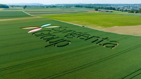
At Syngenta Group we believe global challenges require local solutions. We are the world’s most local agricultural technology and innovation partner. Drawing on the strengths of our businesses and brands we have created an identity that transforms everything it touches.
The formation of Syngenta Group on June 18, 2020 marked the creation of a new leader in agricultural technology and innovation. Syngenta Group unites the strengths of its four Business Units – Syngenta Crop Protection, Syngenta Seeds, ADAMA, and Syngenta Group China – under one umbrella brand.
Our brand identity, which has been nominated for the 2021 European Excellence Awards, is used globally for communication on behalf of the Group. The distinctive customer-facing branding of Syngenta Crop Protection, Syngenta Seeds and ADAMA remains unchanged.
Our identity
Our corporate Identity consists of logos, graphical elements and sounds telling the story of continuous growth rooted in the four seasons, the natural rhythm of nature and its diversity.
We believe in harnessing the full potential of plants to support growers and the global food chain in their efforts to produce healthy, safe and affordable food in a more sustainable and resilient way.
A distinctive logo

The Syngenta Group brand logo represents the vibrancy, wonder and abundance of the four elements that enable agriculture: Water, earth, plants and sunlight. Together these create the conditions for growth and are strongly anchored to nature and the four seasons that all agricultural activities follow. With its fresh colors, the Syngenta Group logo takes the Group into the future, signalizing passion for innovation, a pioneering spirit and close collaboration.
A unique audio branding
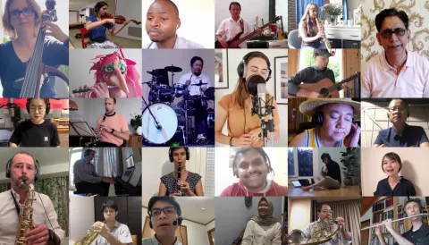
The Syngenta Group sound logo is the Red Dot Award and Transform Asia Award winning acoustic equivalent of our visual logo, capturing the essence of our brand story in only a few seconds.
It conveys a collaborative, genuine and inspiring tone. For our Group sound, every leaf of our logo is a note. When we set these in motion, the rhythm of growth is created.
A recognizable visual identity
Our visual identity expression is inspired by the vibrancy of our distinctive logo. Alongside our dynamic color palette, our visual identity is strengthened by our custom-made patterns, reflecting our logo leaves and the four seasons. The individual leaves come together, representing our people, their diversity and the need for collaboration and partnership as key to success in the future.

Bringing our brand to life


